
Lifestyle
7 Emirati Women Shaping the UAE Today

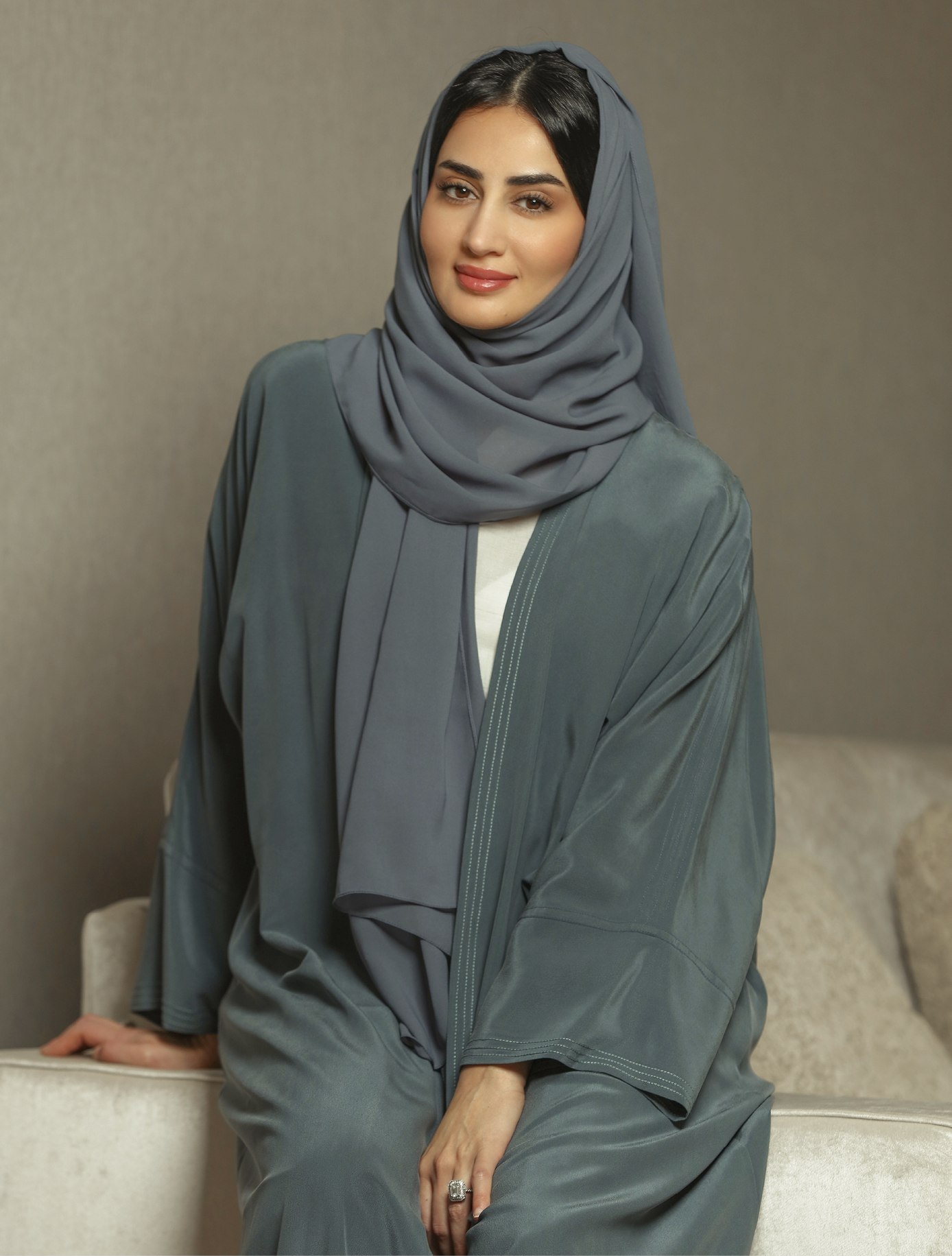
UAE is a land of visionaries, and Emirati women are stepping up, breaking barriers, and redefining what’s possible. And we can see it across industries
Nora Al Matrooshi
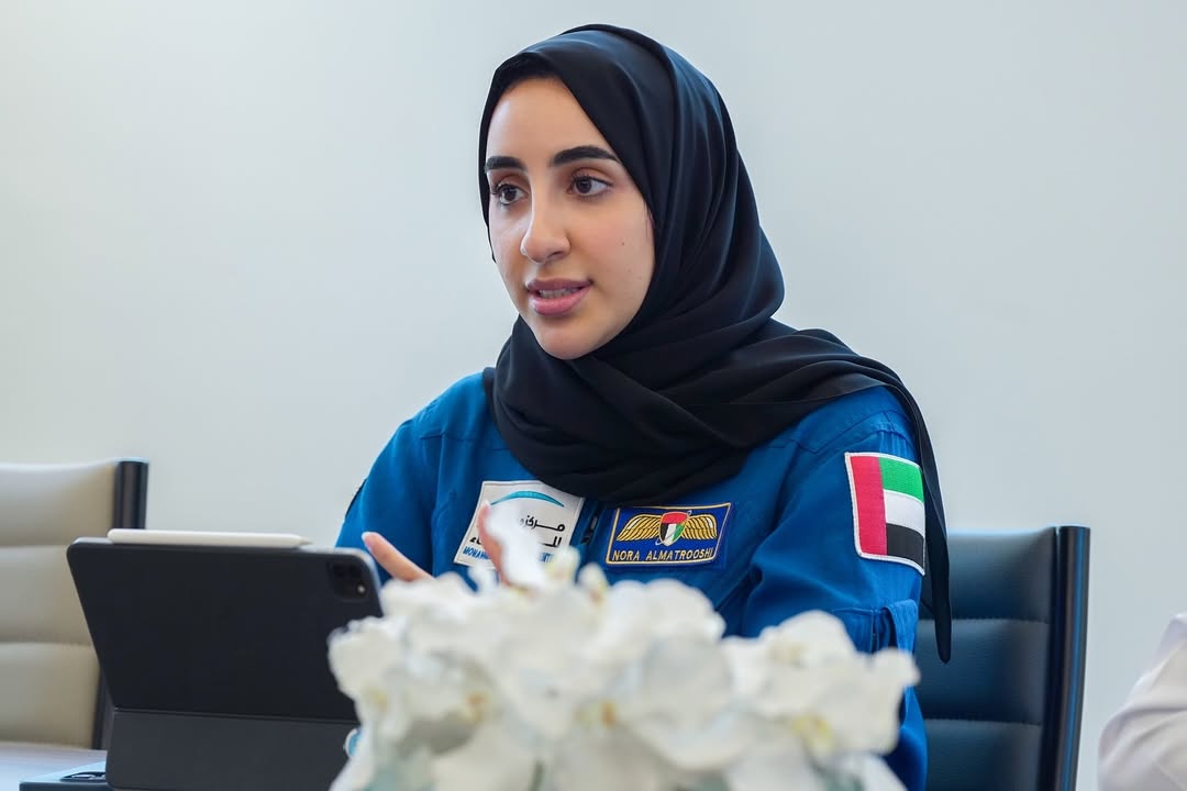
Before becoming the UAE’s first female astronaut, Nora Al Matrooshi was a dedicated long-distance swimmer and a gifted artist, often drawing the dreams she wanted to Chase. Her journey shows what’s possible, inspiring pride and young girls to dream bigger.
Khadija Al Bastaki
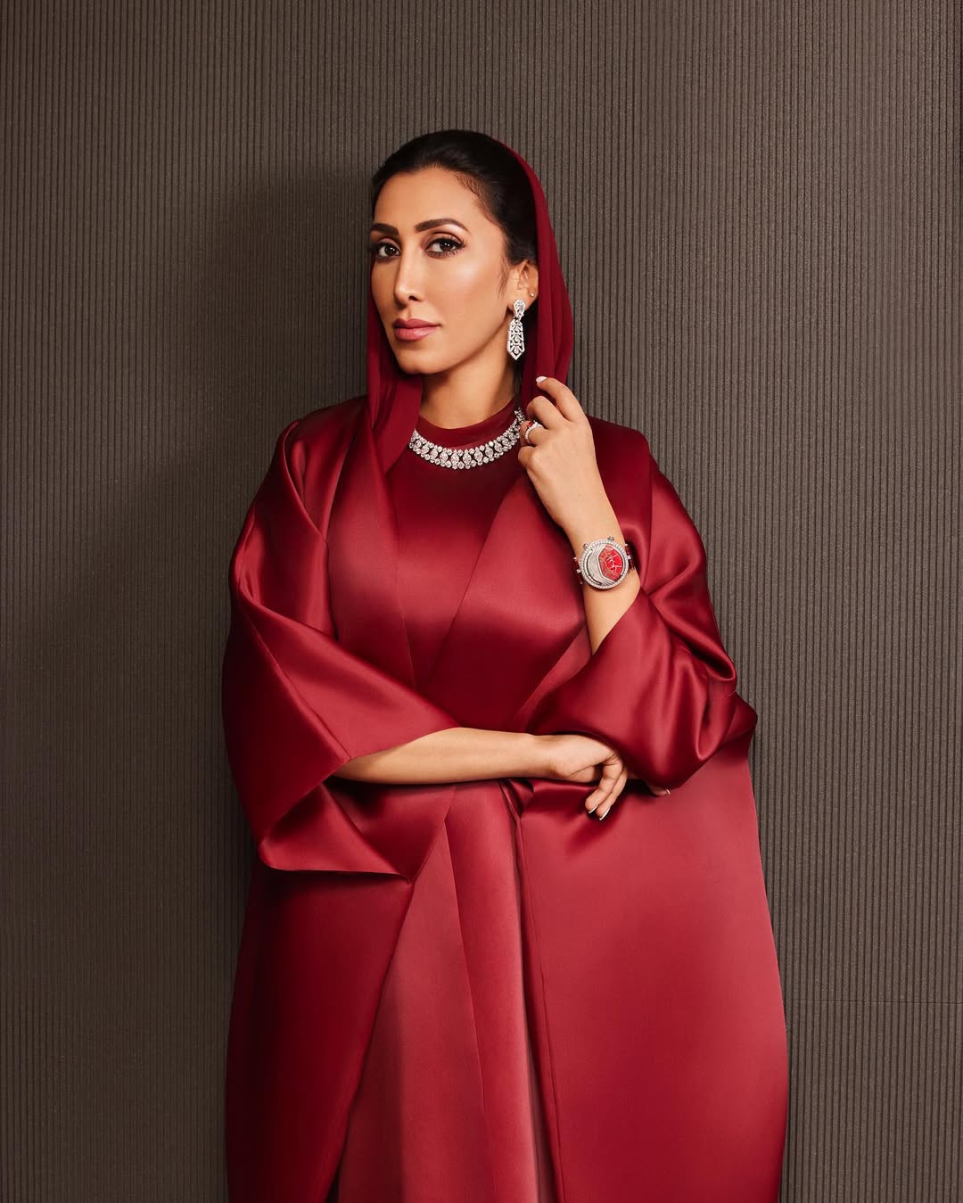
Khadija is the Senior Vice President of Dubai Design District, part of TECOM Group. Since 2019, she has worked to make d3 a hub where designers, artists, and entrepreneurs can meet, collaborate, and bring ideas to life. In 2023, she helped launch Dubai Fashion Week, giving the city a fresh, global platform for fashion.
Amna Al Qubaisi
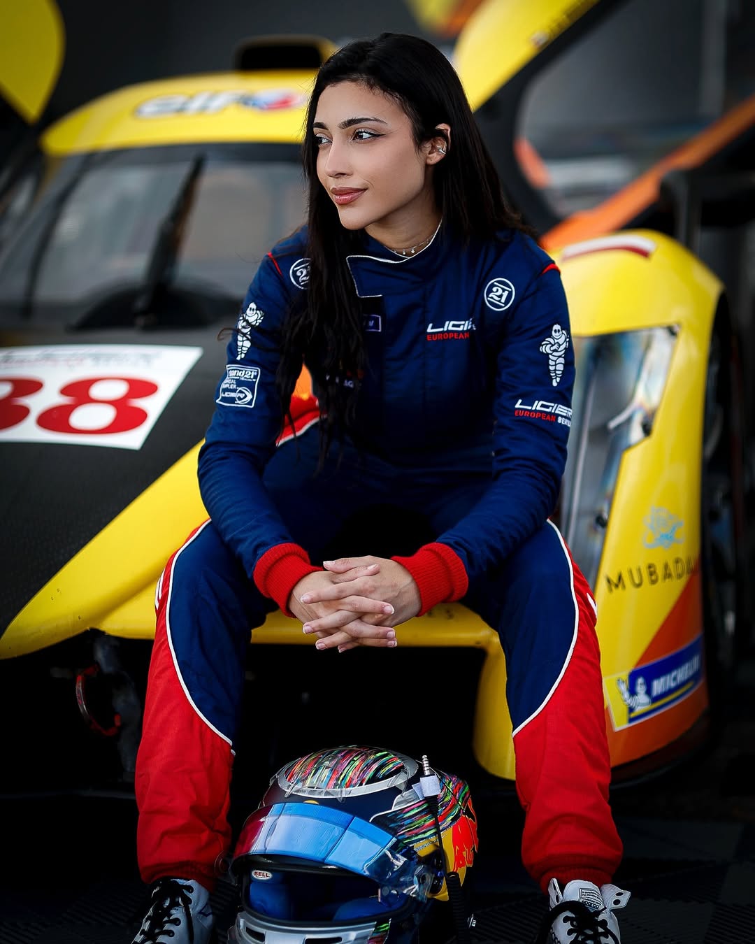
Amna is the UAE’s first female racecar driver. She’s not just competing on tracks worldwide, she’s challenging stereotypes, showing that determination and talent know no gender.
Mariam Almheiri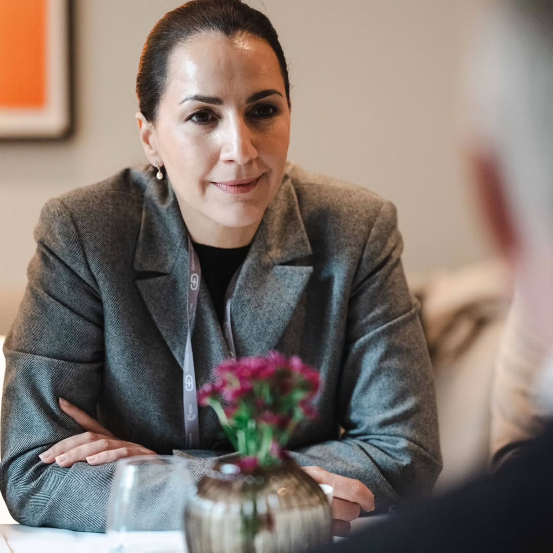
She has worked on protecting the environment, ensuring food security, and promoting climate action. Over the years, she has launched initiatives like the UAE Food Security Strategy and Food Valley, helping the nation produce more, waste less, and embrace innovative solutions. Today, she leads 2PointZero, focusing on sustainable investments, while also representing the UAE in global forums. Her works have shown that caring for the planet is something we can actually achieve when people take action.
Safa Taryam
She helps UAE athletes reach their full potential. She supports them behind the scenes, celebrates their victories, and motivates young Emiratis to follow their passion for sports.
Dr. Aisha Bin Bishr
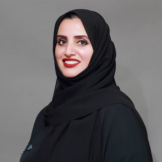
Aisha is helping make Dubai a smarter city by using technology in ways everyone can use and enjoy. Her vision ensures that innovation touches everyday life, shaping cities that are not only smart but human-centered.
Dr. Fatma Al Hashimi
Fatma works in her lab every day, studying stem cells and looking for ways to help patients feel better. Outside the lab, she loves mentoring young Emirati scientists, always encouraging them to ask questions and pursue their curiosity.
Conclusion
These women show what it means to be ambitious and determined. They remind us that real progress comes from hard work, creativity, and never giving up. With Emirati Women’s Day celebrated just last week, it’s a perfect moment to honor them. The UAE’s story is being written by women like these
Read Next Post: Inside the 2025 MTV VMAs: What’s in Store this Year

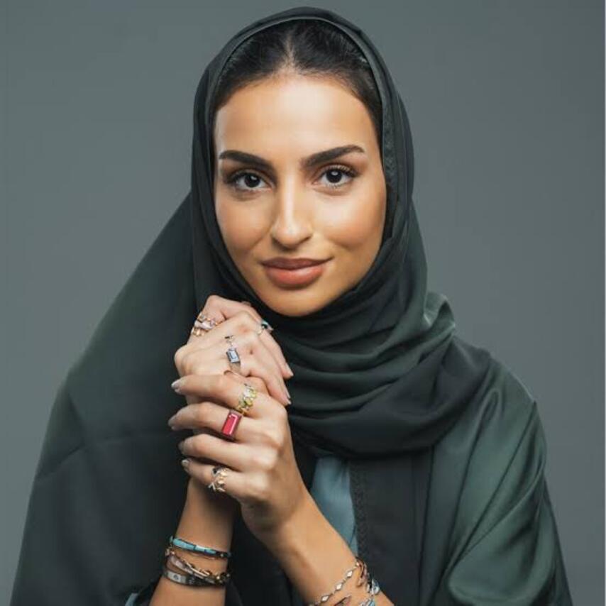
Across jewelry, wellness, furniture, and luxury consulting, Emirati women are building brands that carry personal history and national identity into contemporary spaces. Here are six founders putting distinctly Emirati perspectives at the heart of modern brands.
Noora Shawqi — Noora Shawqi Jewellery
What began as an Instagram account in 2017 to share a love of fine jewellery became a full label a year later. Noora Shawqi is a certified Diamond Graduate from the Gemological Institute of America, holds a Diamond Grader certification from the International Gemological Institute, and completed training at L’Ecole Van Cleef & Arpels. Her collections translate travel, from Sri Lanka to Japan, into fine jewellery made in Dubai with local artisans. Her work has been featured in Vogue Arabia, Grazie Middle East, and JCK. In 2023 the brand also ran a CSR campaign focused on conserving coral reef systems.
Ghaliya Ahli — Gigi Dubai
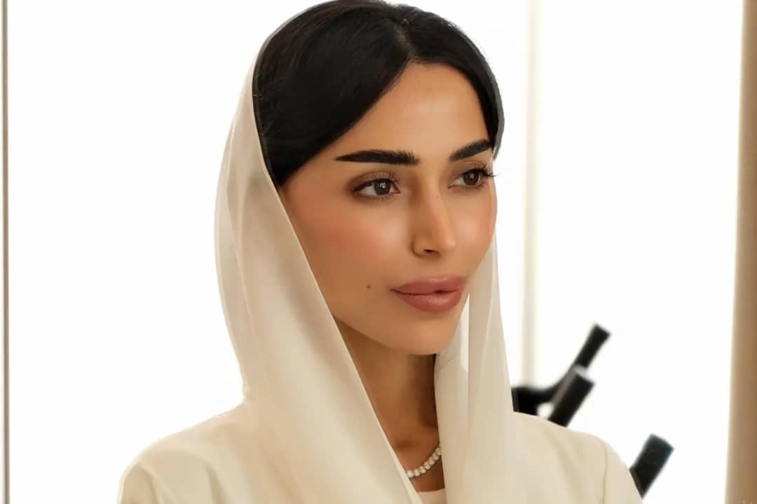
Photo: Soigné Middle East
With a background in marketing and research, Ghaliya Ahli set out to build a brand. Gigi Dubai launched as the city’s first Lagree-method studio, centered on slow, controlled movements on a Megaformer machine. It has since grown into a lifestyle platform across two locations in Mirdif and Nad Al Sheba, built around design, community, and a calendar of events and pop-ups. Ahli has described wanting the space to move beyond neutral wellness aesthetics into something bolder and more culturally aware.
Maitha and Alya Al Suwaidi — Contemporary Spaces
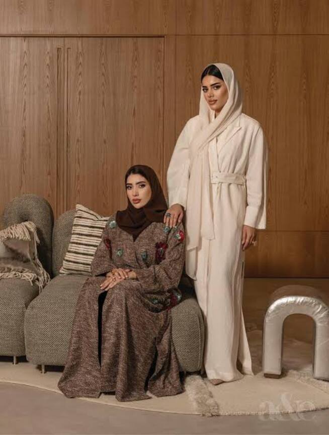
Photo: Instagram-@aeworld_mag
Alongside their brother Obaid, sisters Maitha and Alya Al Suwaidi founded Contemporary Spaces after years spent inside their father’s furniture manufacturing factories. Officially launched in Dubai’s Al Quoz creative district, the studio channels that inherited craft knowledge into locally made furniture and interiors defined by structure, precision, and sculptural clarity, balancing heritage with a distinctly modern design language.
Fatma and Maryam Sahem — Khayal Jewellery
Khayal, the Arabic word for imagination, began when sisters Fatma and Maryam Sahem went looking for a piece of jewellery they had envisioned but could not find. That search became a brand defined by whimsy and fine craftsmanship. Collections draw inspiration from destinations including Japan, Morocco, and the Maldives. Their Enchanted collection later transformed the chequered pattern into a gemstone form, offering a different approach to how the motif could appear in jewellery.
Fatma Al Bannai — Baguette Design
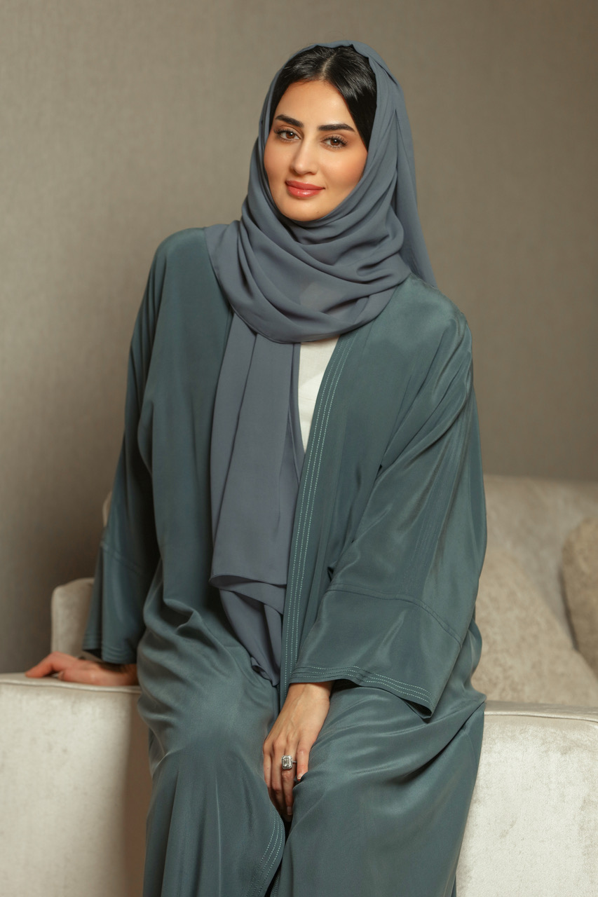
Photo: Instagram – @ aeworld_mag
Before jewellery, Fatma Al Bannai’s creative instincts ran toward writing. That literary sensibility carries into Baguette Design, named after the baguette diamond cut she has favored since childhood. Each collection is conceived narratively, treated like a story translated into wearable form, with attention to line, proportion, and longevity.
Hala Al Gergawi — Tea Before Noon and Elevenish
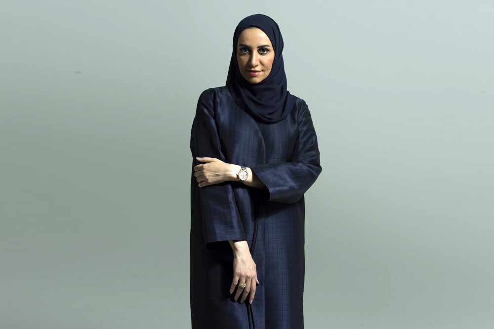
Photo: Getty images
A former Managing Editor of Zahrat Al Khaleej magazine, Hala Al Gergawi began her entrepreneurial path in 2007 with a directory magazine spotlighting Emirati women-owned businesses. That project evolved into Tea Before Noon, relaunched in 2018 as one of the region’s first luxury lifestyle consultancies, helping global brands including Burberry and Dior localize their presence for GCC audiences. In 2021 she founded Elevenish, an online platform for abayas, fragrances, and accessories created by emerging Gulf designers. Al Gergawi has also served as UAE country office manager for Young Arab Leaders and previously sat on the Emirates Business Women Council.
Together these brands reflect a clear shift. They are building from local craft, personal archives, and regional insight, then producing work in the UAE for audiences both here and abroad. In doing so, they are moving Emirati women’s entrepreneurship from representation to ownership, and helping define what modern design in the region looks like.
Read Next Post: UAE to Mark Emirati Women’s Day With Month-Long Celebrations
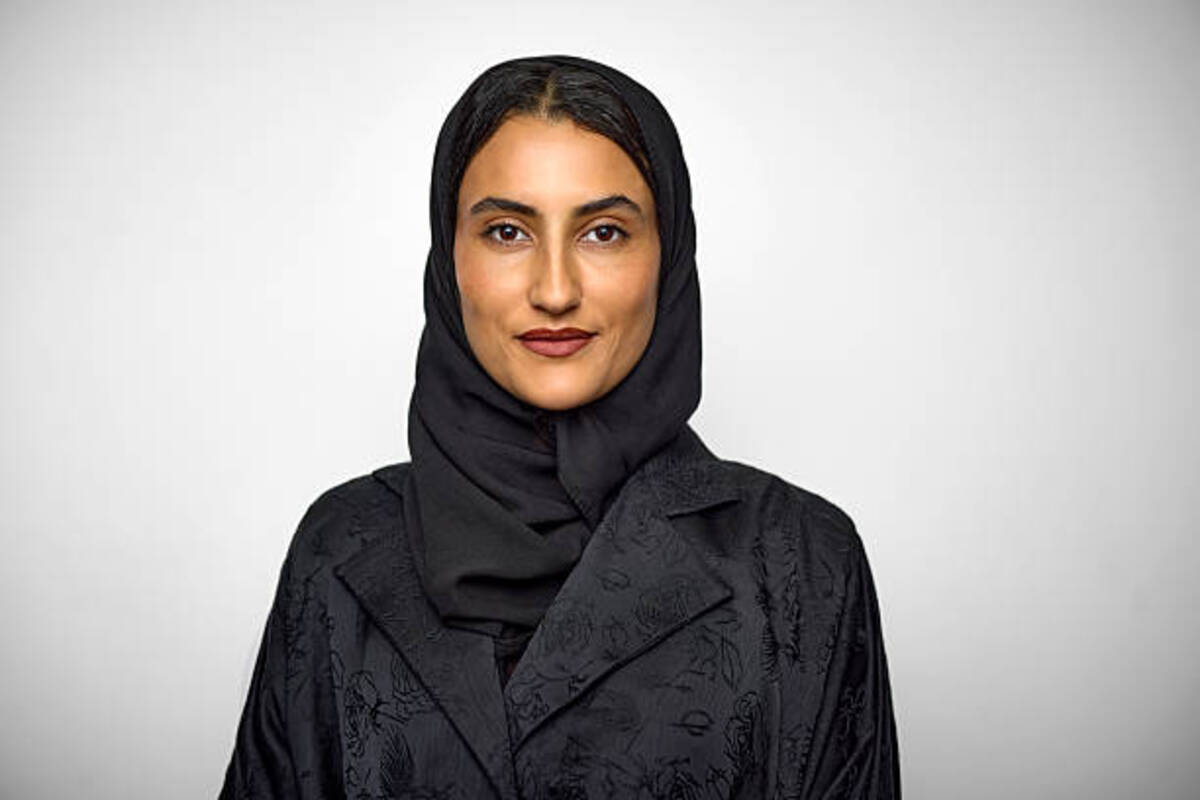
The UAE will mark Emirati Women’s Day on August 28. Emirati Women’s Day is an occasion that celebrates the achievements of Emirati women and highlights their role in the development of the country. For the first time since Emirati Women’s Day started in 2015, the celebration will run for a full month, from August 28 to September 28 2026.
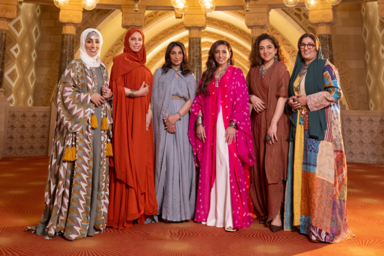
Photo: Emirate women
The expansion was announced by Her Highness Sheikha Fatima bint Mubarak, known as the “Mother of the Nation.” Sheikha Fatima chairs the General Women’s Union, presides over the Supreme Council for Motherhood and Childhood, and leads the Family Development Foundation.
She announced that this year’s Emirati Women’s Day would be observed for longer than a day. Celebrations will continue through the month.
This year’s theme is “Together We Rise Stronger and Better.” The theme takes a different approach, looking beyond individual success stories by Emirati women. Instead it places women’s achievements within families, workplaces, institutions and communities.
Her Highness Sheikha Fatima said Emirati women have reached their position with support, from families, institutions and Emirati men. She also added that Emirati women’s progress also strengthens the UAE as a whole.
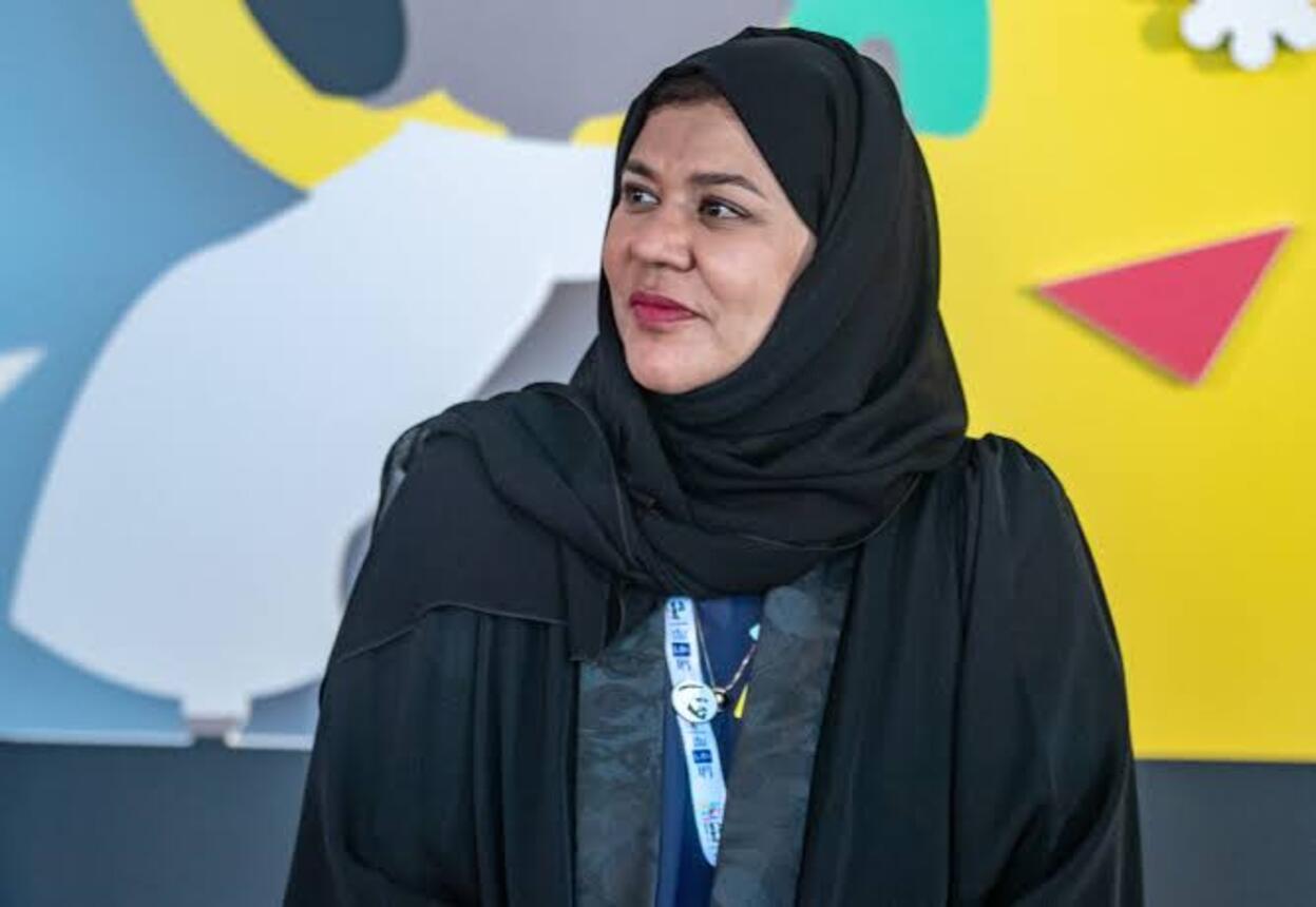
Photo: Getty images
In line with that, this year’s program will also honour men who have supported women’s advancement, reinforcing an emphasis on partnership over competition.
The month-long celebration is part of the Mother of the Nation’s 50:50 Vision, a long-term initiative that looks ahead to 2075 and the role of women in the UAE over the next 50 years.
The observance falls on August 28 each year, a date that also marks the founding of the UAE’s General Women’s Union in 1975. Since then, the occasion has become an annual opportunity to celebrate Emirati women and recognize their contributions across the country. Emirati women currently hold roughly 63 percent of leadership positions across the government sector and 50 percent of seats in the Federal National Council.
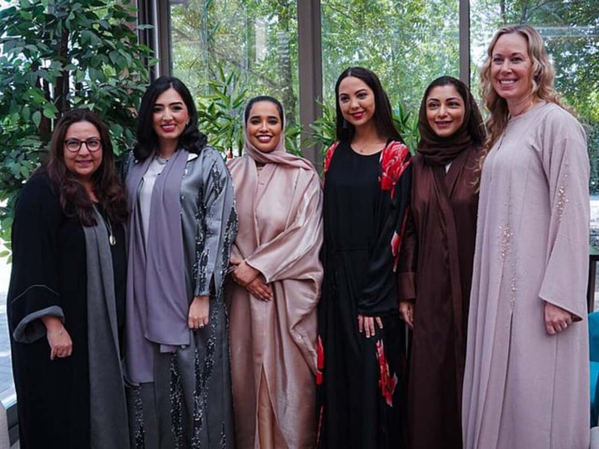
Photo: reflection_stars_pr
With the celebration now stretching across a full month, government entities, businesses, and hospitality venues across the UAE are expected to mark the occasion with initiatives, recognition programs, and public events, according to organizers, with further details to be announced by participating organizations in the lead-up to the month- long program.
Read Next Post: Apple Set to Release iPhone 18: Here’s Everything We Know
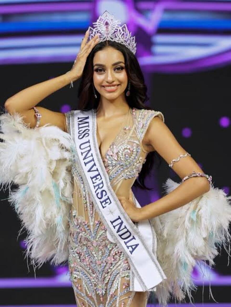
A 19-year-old law student raised in AbuDhabi is preparing to represent India at the Miss Universe pageant in Puerto Rico after being crowned Miss Universe India 2026 in Jaipur. Mejo spoke to Gulf News from Jaipur about how her UAE upbringing prepared her for the international stage.
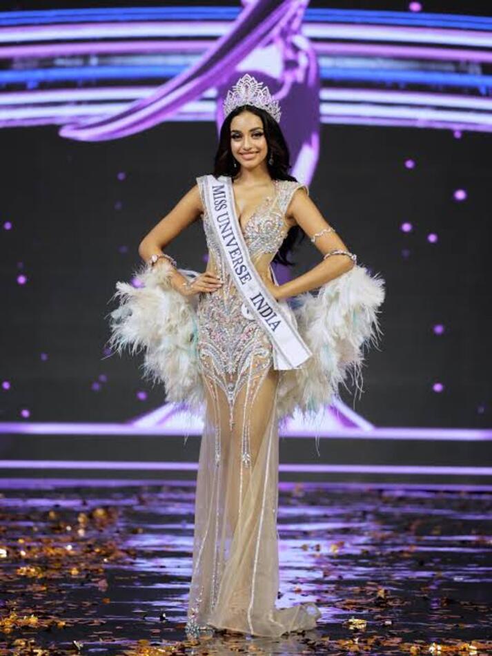
Photo: Instagram-@ missuniverseindiaorg
Mejo credits her upbringing in AbuDhabi with preparing her for the role long before she knew she would represent India on a global stage. Being raised among people from different backgrounds, cultures and languages helped shape her worldview, while allowing her to stay connected to her Indian roots.
Growing up around people from different backgrounds in AbuDhabi gave her a firsthand understanding of different cultures and perspectives. She said that experience shaped the way she sees the world.
That multicultural exposure, she believes, extended beyond social experience into education itself. Her time abroad also sharpened her perspective on India itself. Watching how her country was perceived by people from across the globe reinforced her sense of India as a global powerhouse, giving her the confidence to step into the role of international representative.
Roots in Dance and Family Support
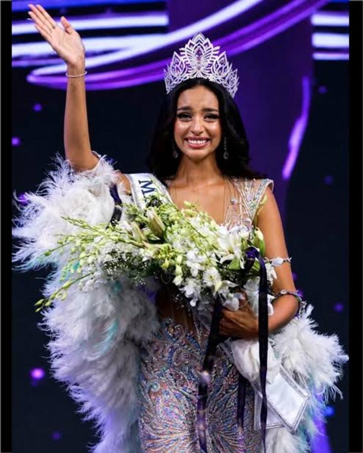
Photo: Instagram- @missuniverseindiaorg
Before entering pageantry, Mejo spent years as an Indian classical dancer, taking the stage from around the age of five.
Her mother had participated in small pageants growing up in Kerala, though Mejo says she entered the pageant world without any parental pressure to do so. When she told her parents about her plans, they responded with encouragement, focusing on how to help her take the first step rather than questioning the decision.
The Night of the Crowning
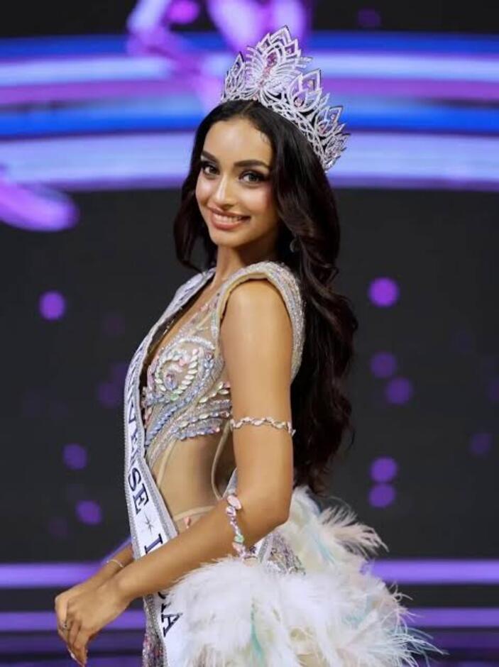
Photo: Instagram- @tcx.official
Mejo competed against 51 other contestants for the national title at the August 23, 2026, pageant. She said she felt unusually calm just before going on stage, but that changed completely when her name was announced as the winner.
Life After the Crown
Mejo has been candid about aspects of pageant life that rarely make headlines. Rather than restrictive dieting, she says she ate pizzas and burgers throughout the competition, and celebrated her win with the same indulgence in the early hours of the morning. She has been equally direct about her views on body image within the industry, arguing that a body sustained through starvation was never truly one’s own to begin with.
Her first night as titleholder was spent guarding the crown itself, having slept beside its box and woken with marks from its edges the following morning.
Beyond the pageant, opportunities are already surfacing. Mejo says she has received offers spanning brand ambassadorships and film roles, with acting long standing among her personal ambitions. For now, she says her focus remains singular: representing India on the Miss Universe stage and bringing the international crown home.
Read Next Post: Erling Haaland Arrives in Norway with a New Bag and a Taxidermied Raccoon

The Standout New Watches From Geneva Watch Days 2026

Princess Leonor Begins University Journey After Three Years in the Military

Amouage Introduces Two Intense Extrait Perfumes Inspired by Transformation


-

 Top Xclusiv4 months ago
Kendall Jenner and Jacob Elordi Join Kylie Jenner and Timothée Chalamet for a Double Date
-
 Top Xclusiv4 months ago
Kylie Jenner Sued by Second Housekeeper Over Alleged Abuse Claims.
-

 Celebrity news2 months ago
Lamar Odom Explains His Comments About Marrying Khloé Kardashian for Fame
-

 Top Xclusiv5 months ago
Are Kendall Jenner and Jacob Elordi Dating? What We Know So Far After Coachella
-

 Celebrity Style5 months ago
Ashley Simone Five-Outfit Run for ‘The Devil Wears Prada 2’ World Premiere
-

 Accessories5 months ago
Watches and Wonders 2026: The Biggest Moments So Far
-

 Top Xclusiv5 months ago
Selena Gomez and Demi Lovato Reunited on Opening Night of Her ‘It’s Not That Deep’ Tour
-
 Fashion5 months ago
Matthieu Blazy Presents His First Chanel Cruise Show in Biarritz